When it comes to automobiles, my tastes have always been embarrassingly mundane. The car guy in our household is my Corvette-driving wife Marie — I’m content as long as a vehicle gets me, my passengers, and our belongings from point A to point B in reasonable comfort and safety. And so it never even occurred to me to lust after anything manufactured by Audi, a carmaker which most definitely caters to people who love to drive.
That changed last year when I took a tour of the Silicon Valley research lab of Audi’s parent company, Volkswagen. My eyes lit up when our guide showed us a slick, Internet-connected navigation system based on Google Earth. The A7, a new Audi that’s arrived early for the 2012 model year, sports that system as an option; so will the 2012 A6, A8, and Q7, and other models. Last weekend, I borrowed an A7 from Audi and cruised around Northern California checking out the navigation that had left me agog in the lab, as well as other features.
The A7 is a sporty, roomy hatchback — a “sportback” in Audi parlance — that starts at $59,250, or $62,870 with Google Earth and the other information-and-entertainment features I tried. It’s packed with the sort of stuff that gets motorheads’ pulses pounding: a 310-horsepower supercharged V6 engine, an eight-speed Tiptronic transmission, Quattro all-wheel drive, and an interior that’s resplendent in leather, brushed aluminum, and copious amounts of real wood. I largely ignored all this and focused on the digital-age gadgetry, which is also copious: navigation, phone connectivity, SD slots, 3G data, wi-fi, and more.
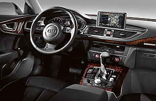
All of these are built into a new version of MMI , Audi’s infotainment system. When you start the engine, a seven-inch screen slides out of the dashboard and swivels into place; the car uses it for everything from the navigation and entertainment features to the climate controls to external cameras that help you back up and parallel park. A smaller display is nestled between the tachometer and the odometer. There’s no touchscreen input, but I didn’t miss it much — my fingertips quickly trained themselves to use the MMI’s knobs, buttons, and steering wheel-mounted controls.
The MMI’s voice input, however, proved challenging. Sometimes it understood me perfectly. In other instances, it confidently did something other than what I’d just requested, or simply said “Pardon?” in its robotic-female voice. I was much happier avoiding it and relying on other methods of input, of which there are several. You can enter alphanumeric information by twisting and pushing an oversized knob, a process that reminded me of using the Dymo embossing labelmakers of my 1970s youth. Even better: a touch pad lets you draw characters one-by-one with your finger. I swiftly entered destination names this way with nary a typo, even though I’m a southpaw and was using my right hand.
The thing that got me excited by the Google-powered navigation when I saw it in Volkswagen’s lab was the satellite imagery, a far cry from the blocky graphics of my 2004 Mazda 3’s nav system. Behind the wheel, however, I quickly concluded that all that realism wasn’t helpful. What I needed most were minimalist maps I could interpret at a glance, an option which the MMI also provides. Besides, photographic maps in a car navigation system seem redundant. When I drove the A7 up the California coast from Monterey to San Francisco, Google Earth was splendiferous — but nowhere near as eye-popping as the real-world version all around me.
See pictures of the best cars for 2011.